A typical way to summaries teams performance when a season has finished is to look at their xG differential, as the difference between the xG For and the xG Against. However how to calculate those xG Against values is not always clear or easy to obtain when you only have the xG For stats.
In this article I will share an R code example with you that represents one of the different approaches which allows you to calculate that in addition to create a graph with the outputs.
Let’s say you already got the StatsBomb data using the code shared in our previous article but this time I’ve focused on the Premier League 2015/2016 season, which comprises 380 games (38 game weeks of 10 games involving 20 teams)
I would suggest you to store the cleaned eventing data in a folder named ‘data’ as CSV file running the following code line premier_2015_16 = write_csv(premier_2015_16_eventing_clean, "data/eventing_data_premier_2015_16_statsbomb.csv")
xG Against calculation
The following code calculate the xG Against in addition to the xG For values per team
For that I am considering:
Filtering in only unblocked shots
Removing penalties, ensuring we focus on Non-Penalty xG (NPxG) for both cases
Using average xG values per game instead of per 90 minutes played, considering that all teams played 38 games with minimal extra time differences (approximately 1%).
Show code
# load packageslibrary(readr)library(janitor)library(dplyr)# read datapremier_2015_16 =read_csv("data/eventing_data_premier_2015_16_statsbomb.csv") %>%clean_names()# 1) filtering in only unblocked shots and target columnstarget_shots = premier_2015_16 %>%filter(type_name =="Shot"& shot_outcome_name !="BLOCK"& shot_type_name !="Penalty") %>%select(match_id, team = team_name, type_name, shot_type_name, outcome = shot_outcome_name, xg = shot_statsbomb_xg)# 2) get total xG per gamexg_game = target_shots %>%group_by(match_id) %>%summarise(total_xg =sum(xg, na.rm = T))# 3) get xg FOR per team per gamexg_team_game = target_shots %>%group_by(match_id, team) %>%summarise(xg_for =sum(xg, na.rm = T),games_played =length(unique(match_id)))# 4) join both tables and get the xG Against per team per game# as the difference betweeen total and For valuesall_stats_team_game = xg_game %>%left_join(xg_team_game, by ="match_id") %>%mutate(xg_against = total_xg - xg_for,)# 5) get the final values per teamteam_stats = all_stats_team_game %>%group_by(team) %>%summarise(across(c(games_played, xg_for, xg_against), ~sum(.x))) %>%mutate(xg_dif = xg_for - xg_against,avg_xg_for_per_game =round(xg_for/games_played, 2),avg_xg_against_per_game =round(xg_against/games_played, 2)) %>%arrange(desc(xg_dif))
Output
Now, let’s delve into a scatterplot that allows us to see how teams performed in terms of xG. I’ve used several R packages, including {ggplot2}, {ggimage}, {cowplot}, and {showtext}, to create this informative graphic.
In case you are interested, you could check the code by clicking in the arrow “Code” part.
Team logos as PNG files were downloaded from here. Premier League logo from here.
Show code
library(stringr)library(ggplot2)# package to join graphs/objectslibrary(cowplot)# package to add imageslibrary(ggimage)# font family customizationlibrary(showtext)font_add_google('Fira Sans', 'firasans')showtext_auto()# fix auxiliary valuesMIN_AXIS =round(min(team_stats$avg_xg_for_per_game, team_stats$avg_xg_against_per_game), 2)MAX_AXIS =round(max(team_stats$avg_xg_for_per_game, team_stats$avg_xg_against_per_game), 2)MEAN_XG_FOR =round(mean(team_stats$avg_xg_for_per_game), 2)MEAN_XG_AGAINST =round(mean(team_stats$avg_xg_against_per_game), 2)DELTA =0.03COL_TEXT_LINES ="grey90"# some team names processing in order to match with the PNG file namesteam_stats_with_logos = team_stats %>%mutate(team =case_when(team =="Tottenham Hotspur"~"Tottenham", team =="AFC Bournemouth"~"Bournemouth", team =="Leicester City"~"Leicester", team =="Norwich City"~"Norwich", team =="Newcastle United"~"Newcastle", team =="West Ham United"~"West Ham", team =="Stoke City"~"Stoke_City", team =="Swansea City"~"Swansea_City", team =="West Bromwich Albion"~"West Brownwich Albion",TRUE~ team),logo =paste0("images/", tolower(str_replace_all(team, " ", "")), ".png"))p1 =ggplot(data = team_stats_with_logos, aes(x = avg_xg_for_per_game, y = avg_xg_against_per_game)) +# diagonalgeom_abline(slope = MEAN_XG_AGAINST/MEAN_XG_FOR, intercept =0, linetype =2, col ="#fff7bc", linewidth =0.5, alpha =0.7) +# mean xG FOR line and labelgeom_hline(yintercept = MEAN_XG_AGAINST, linetype =2, linewidth =0.8, col ="#fe9929") +annotate("text", x = MIN_AXIS + DELTA, y = MEAN_XG_AGAINST + DELTA, size =10,label ="Avg. NPxG Against per game", col ="#fe9929", hjust =0,family ='firasans') +#mean xG Against line and labelgeom_vline(xintercept = MEAN_XG_FOR, linetype =2, linewidth =0.8, col ="#41b6c4") +annotate("text", x = MEAN_XG_FOR + DELTA, y = MIN_AXIS + DELTA, size =10,label ="Avg. NPxG For per game", col ="#41b6c4", hjust =0,family ='firasans') +# theme, labels and axis settingstheme_minimal() +scale_y_continuous(limits =c(MIN_AXIS - DELTA, MAX_AXIS + DELTA), breaks =seq(MIN_AXIS, MAX_AXIS, 0.1), expand =c(0,0)) +scale_x_continuous(limits =c(MIN_AXIS - DELTA, MAX_AXIS + DELTA), breaks =seq(MIN_AXIS, MAX_AXIS, 0.1), expand =c(0,0)) +labs(x ="\nAvg. NPxG For per game", y ="Avg. NPxG Against per game\n", title ="Avg. NPxG For & Against per game",subtitle ="Premier League 2015-2016\n",caption ="@DatoFutbol_cl | Data: StatsBomb") +theme(legend.position ="none",panel.background =element_rect(fill ="#252525", colour = COL_TEXT_LINES),plot.background =element_rect(fill ="#252525", colour ="transparent"),panel.grid.minor.x =element_blank(),panel.grid =element_line(colour ="grey50", size =0.1),text =element_text(family ='firasans', colour = COL_TEXT_LINES, size =30),axis.ticks =element_line(colour = COL_TEXT_LINES),axis.text =element_text(colour = COL_TEXT_LINES),axis.title =element_text(colour = COL_TEXT_LINES),plot.margin =margin(0.7, 1, 0.5, 0.5, "cm")) +# adding imagesgeom_image(aes(image = logo), size =0.05, by ="width", asp =1.3)# join graph with the premier league logop2 =ggdraw() +draw_plot(p1) +draw_image("images/premier.png", x =0.4, y =0.45, scale =0.1)p2# export the output as PNG fileggsave("images/scatterplot_premier_league_2015_16.png", width =12, height =10)
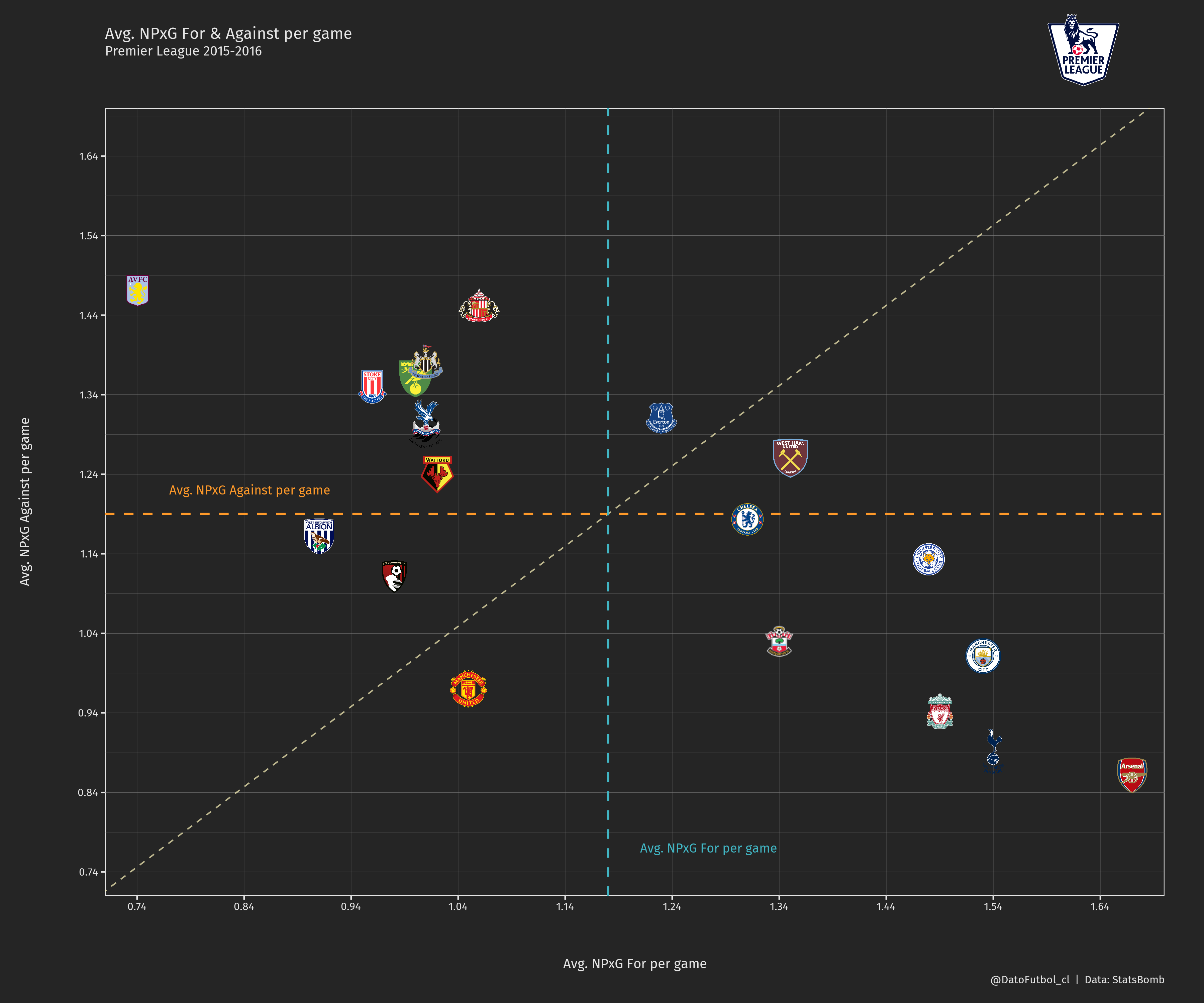
The image shows:
Seven teams (Arsenal, Spurs, Liverpool, M. City, Leicester, Southampton & Chelsea) are located in the “Great performance” rectangle (right-bottom one). It means they obtained a higher than the league average xG For and a lower than the league average xG Against values.
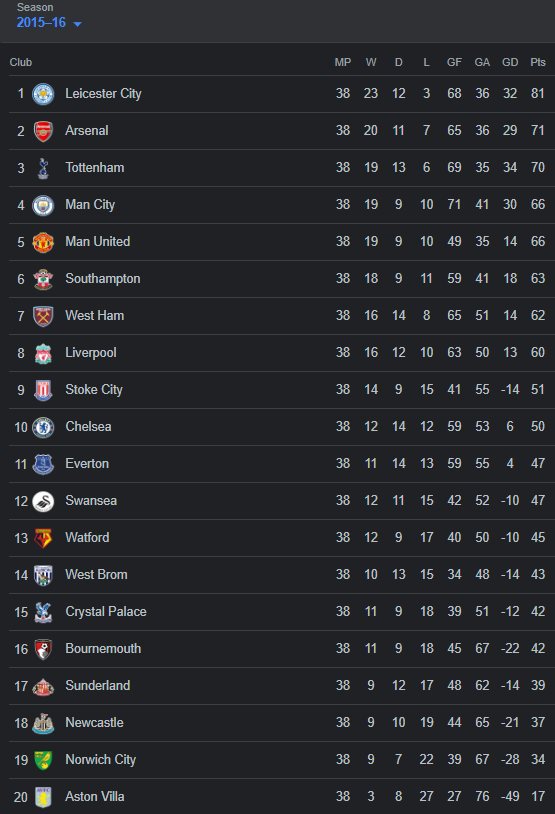
In addition to above, if we look at the final standings for that season (table image below*), all those teams finished at the top 10 positions. Moreover, it is also valid when we consider the 9 teams located below the diagonal (the already 7 mentioned teams plus West Ham and M. United).
As the opposite point of view, 10 of 11 eleven teams above the diagonal (avg. xG Against higher than the avg. xG For) finished in the bottom 10 positions of the final table. So, the only team that in some way broke up the expected behaviour based on its xG differential was Stoke City.
*Considers that the values on this table includes penalty goals and own-goals.
To wrap up, our analysis hints at the significance of xG differential (xG For - xG Against) and its potential correlation with final table positions. This metric plays a vital role in calculating Expected Points and can provide valuable insights into a team’s performance. In our future posts, we might explore this topic further.
Thanks for taking the time to read and share this article. Your interest and feedback are greatly appreciated!